Many people yearn for an earlier era when life moved at a slower, more deliberate pace. With a record player, listeners are forced to sit down and enjoy the music. Since records are a staple of the past, this logo rebrand was created around a retro aesthetic that gives music lovers that nostalgic feeling found in the grooves of vinyl.
PLAID ROOM RECORDS
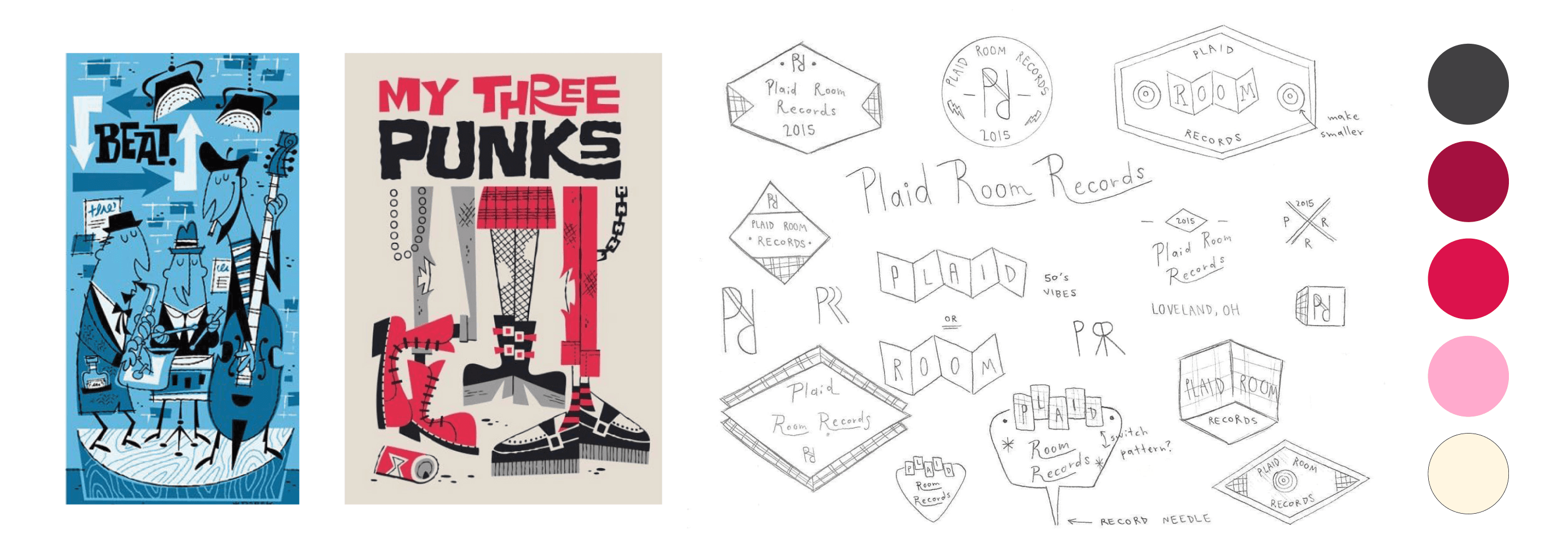
LOGO IDEATION
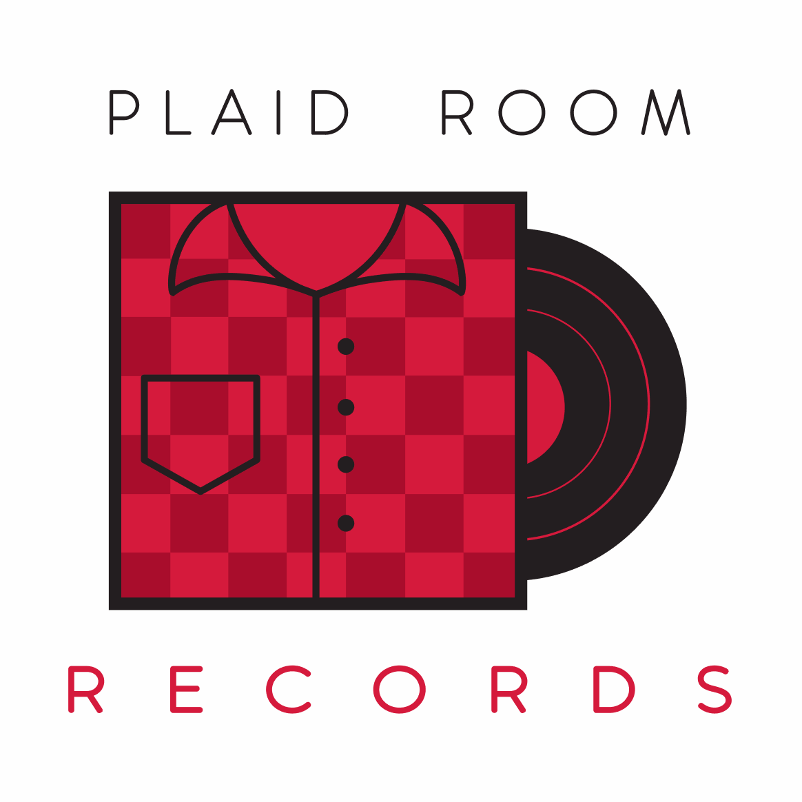
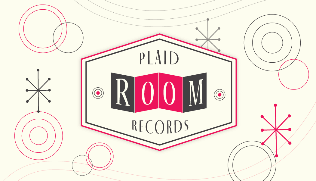
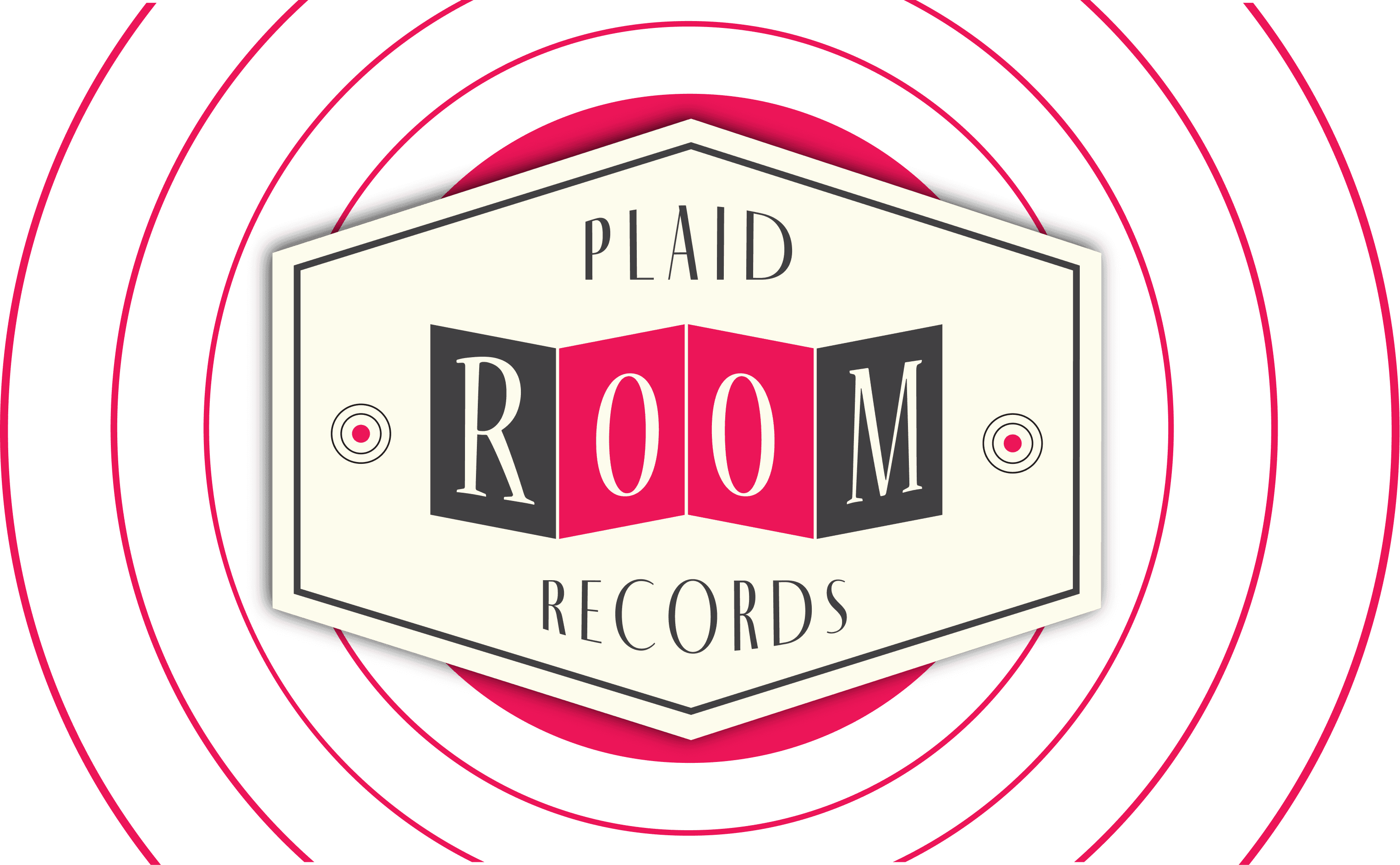
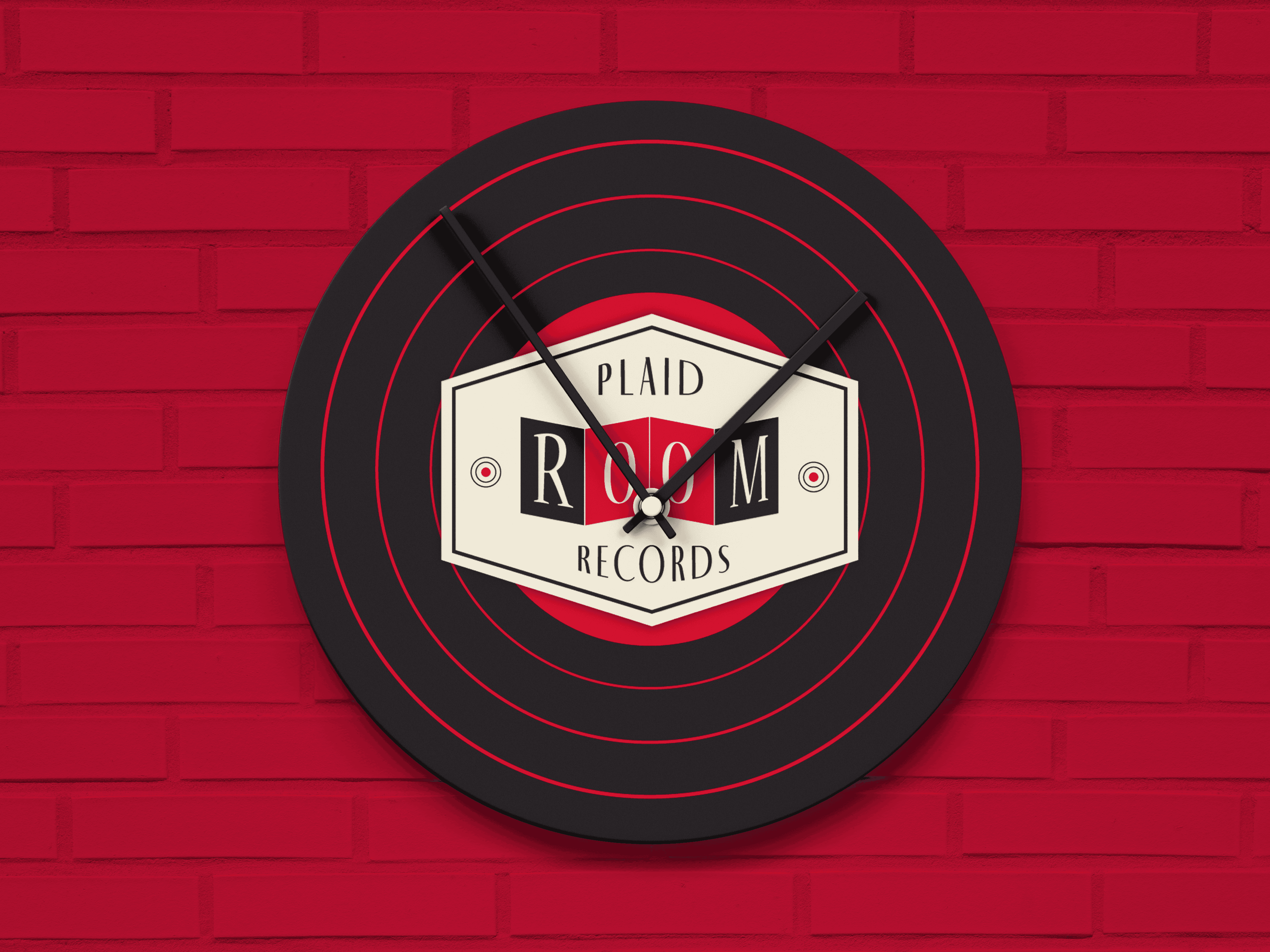
I chose red as the primary color because red is strongly associated with high energy and is one of the most common hues found in traditional plaid patterns, making the design feel bold yet familiar.

VISUAL DIRECTION
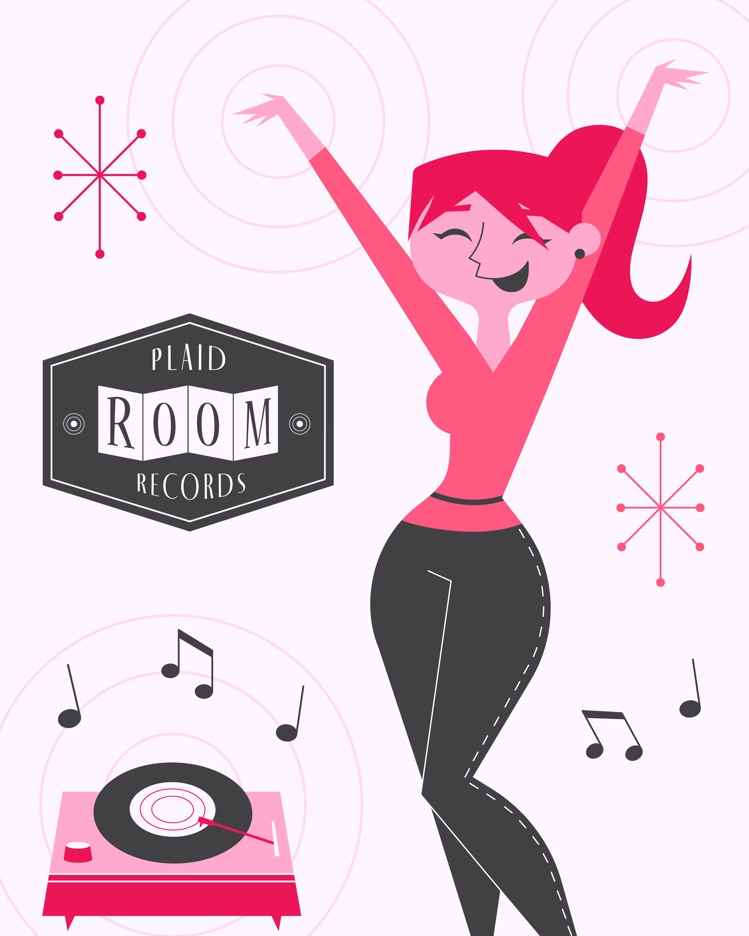
I picked a 1950’s aesthetic to capture the beginning of the vinyl golden age. I wanted to honor the time it became the dominant format—a decade that helped shape how we think about music culture and audio quality today.
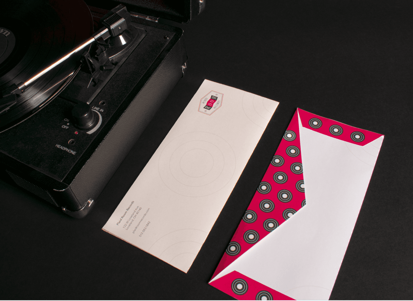
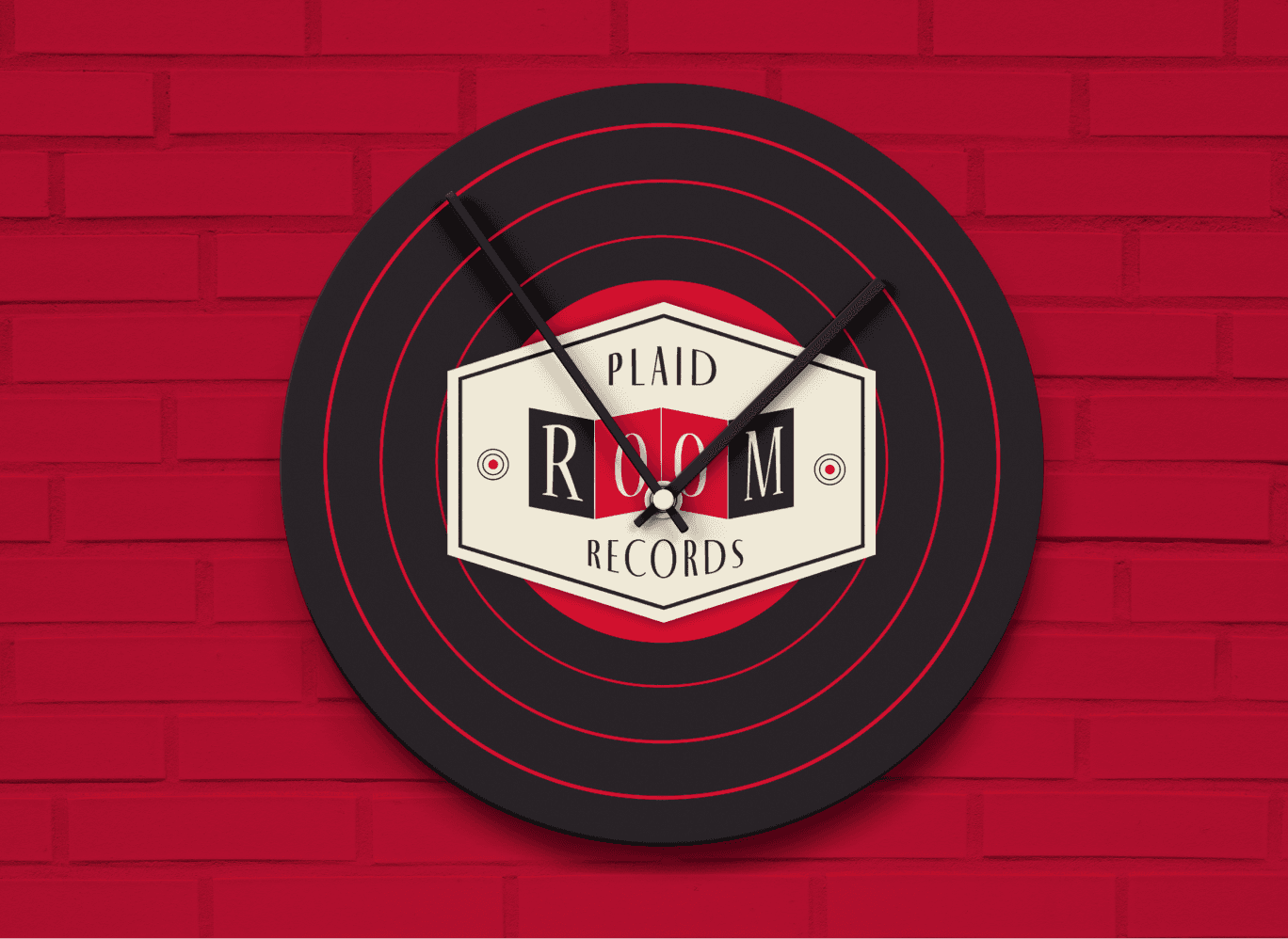
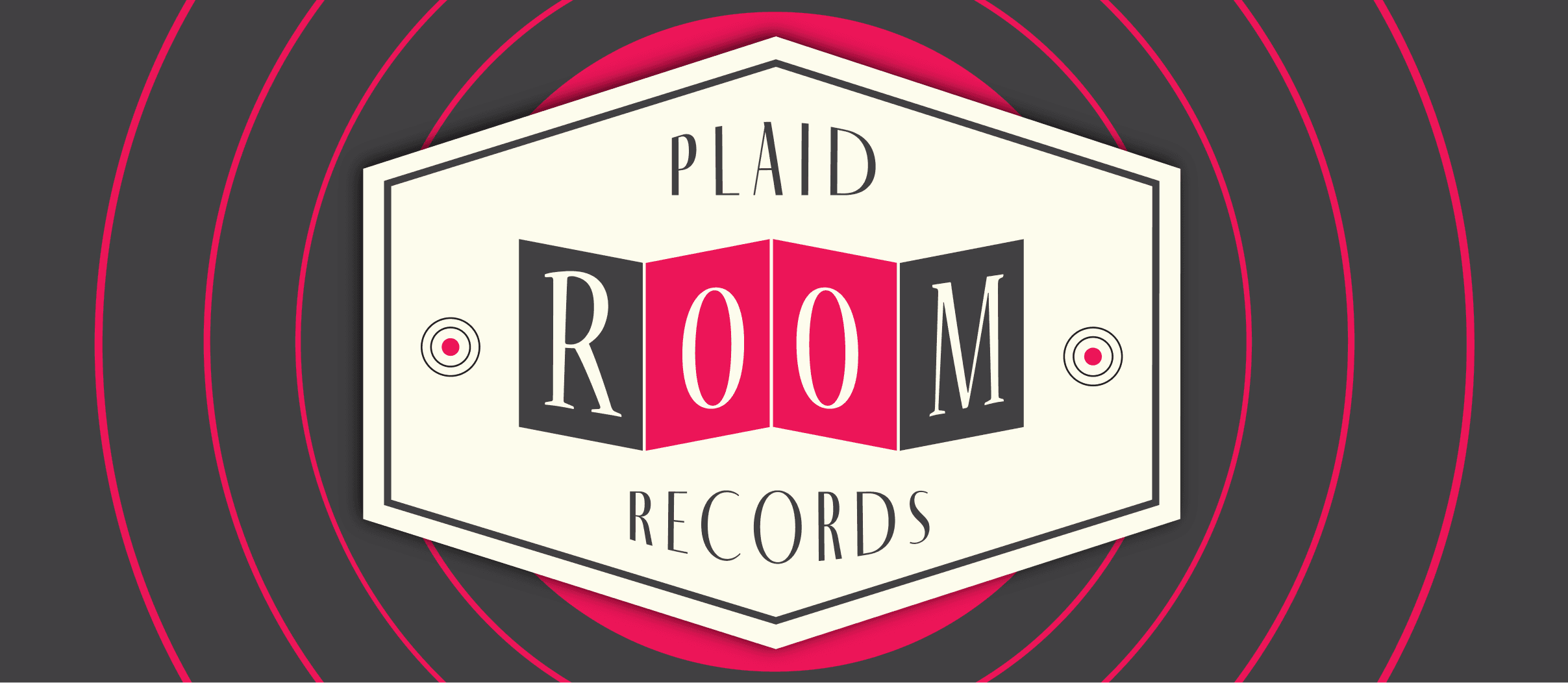
I used circles as a key element to reference the grooves of vinyl records and to balance the design against the logo’s more angular look. The contrast between the soft curves and the sharp angles helps create visual harmony while reinforcing the thematic connection to vinyl.
PLAID ROOM RECORDS
BRAND IDENTITY
LOGO DESIGN
PRINT DESIGN
One of the reasons vinyl records have resurged in popularity is that many people yearn for an earlier era when life moved at a slower, more deliberate pace. With a record player, listeners are forced to sit down and enjoy the music. Since records are a staple of the past, this logo rebrand was created around a retro aesthetic that gives music lovers that nostalgic feeling found in the grooves of vinyl.
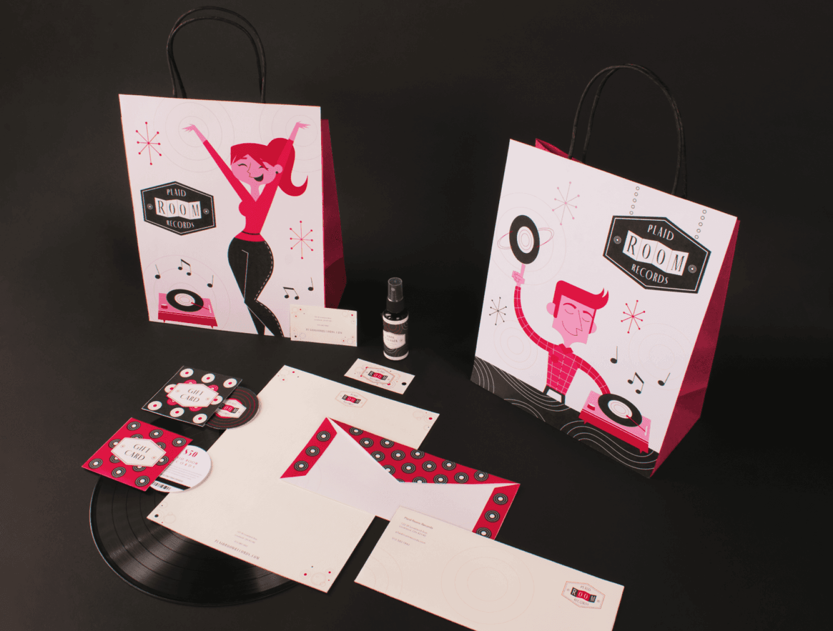
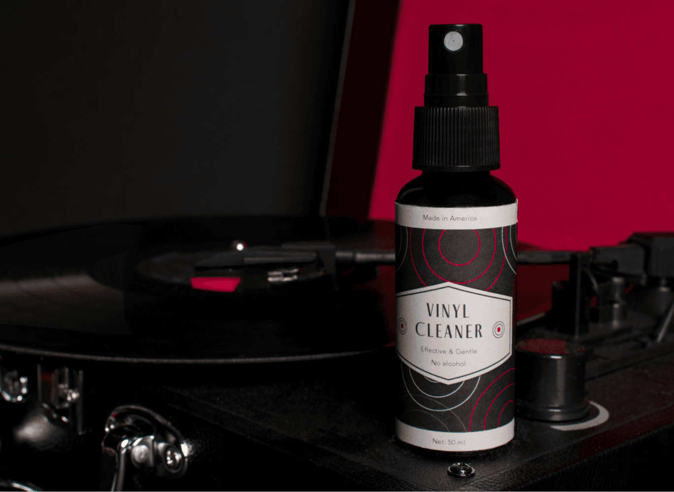
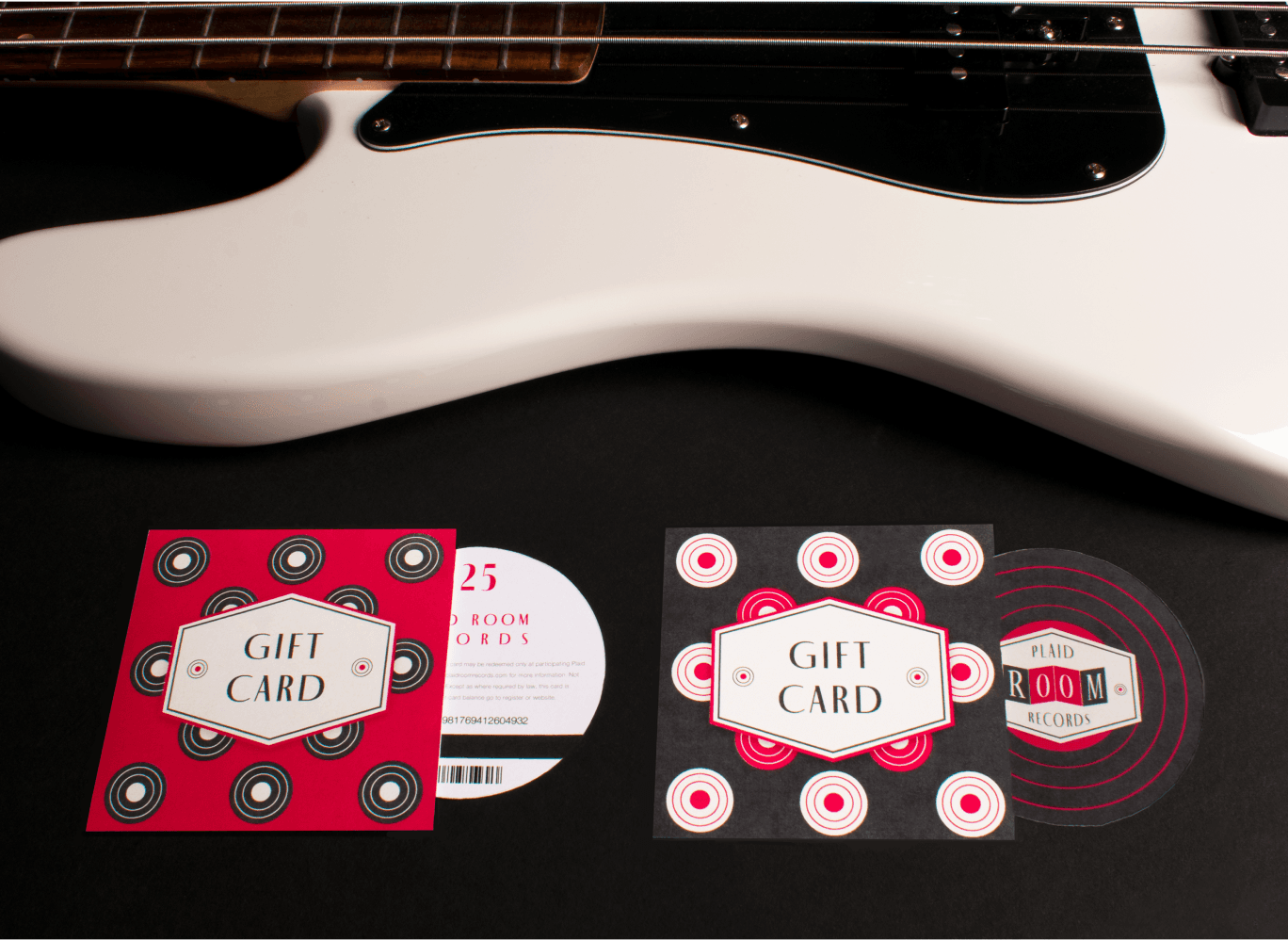
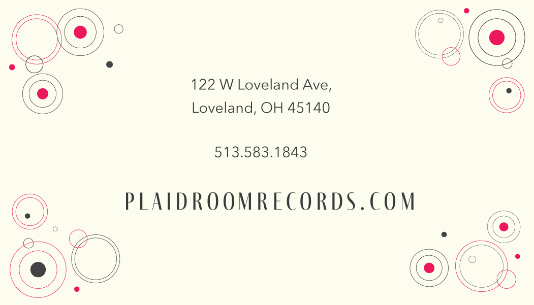
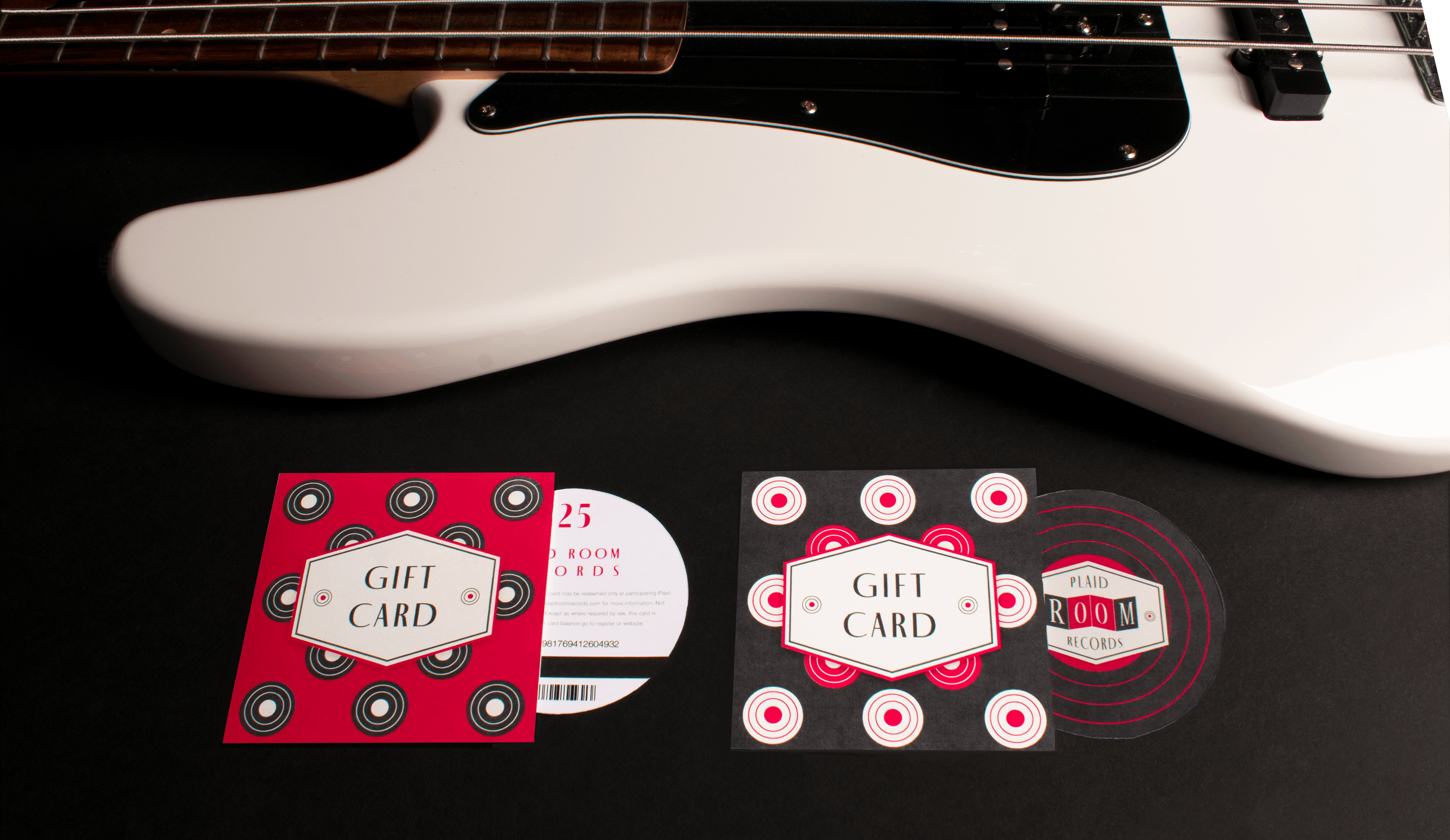
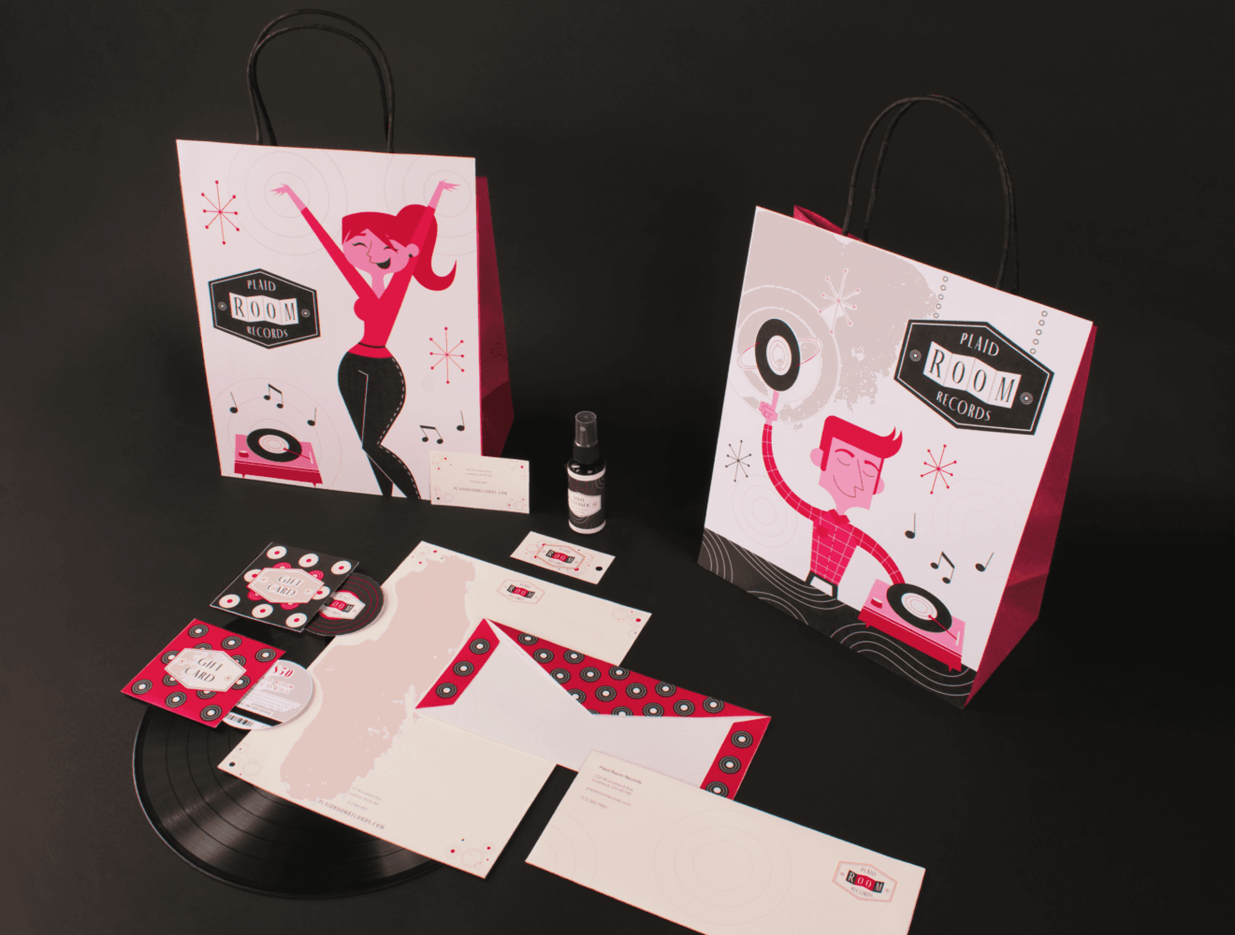
Plaid Room Records is a small local shop that sells both old and new albums. Many of the deliverables feature patterns and icons to showcase the playful 1950’s vibes while maintaining a modern appeal.

I used circles as a key element to reference the grooves of vinyl records and to balance the design against the logo’s more angular look. The contrast between the soft curves and the sharp angles helps create visual harmony while reinforcing the thematic connection to vinyl.

LOGO IDEATION
I chose red as the primary color because red is strongly associated with high energy and is one of the most common hues found in traditional plaid patterns, making the design feel both bold and familiar.

VISUAL DIRECTION
I picked a 1950’s cartoon aesthetic to capture the beginning of the vinyl record golden age. I wanted to honor the time it became the dominant format—a decade that helped shape how we think about music culture and audio quality today.
PLAID ROOM RECORDS
BRAND IDENTITY
LOGO DESIGN
PRINT DESIGN
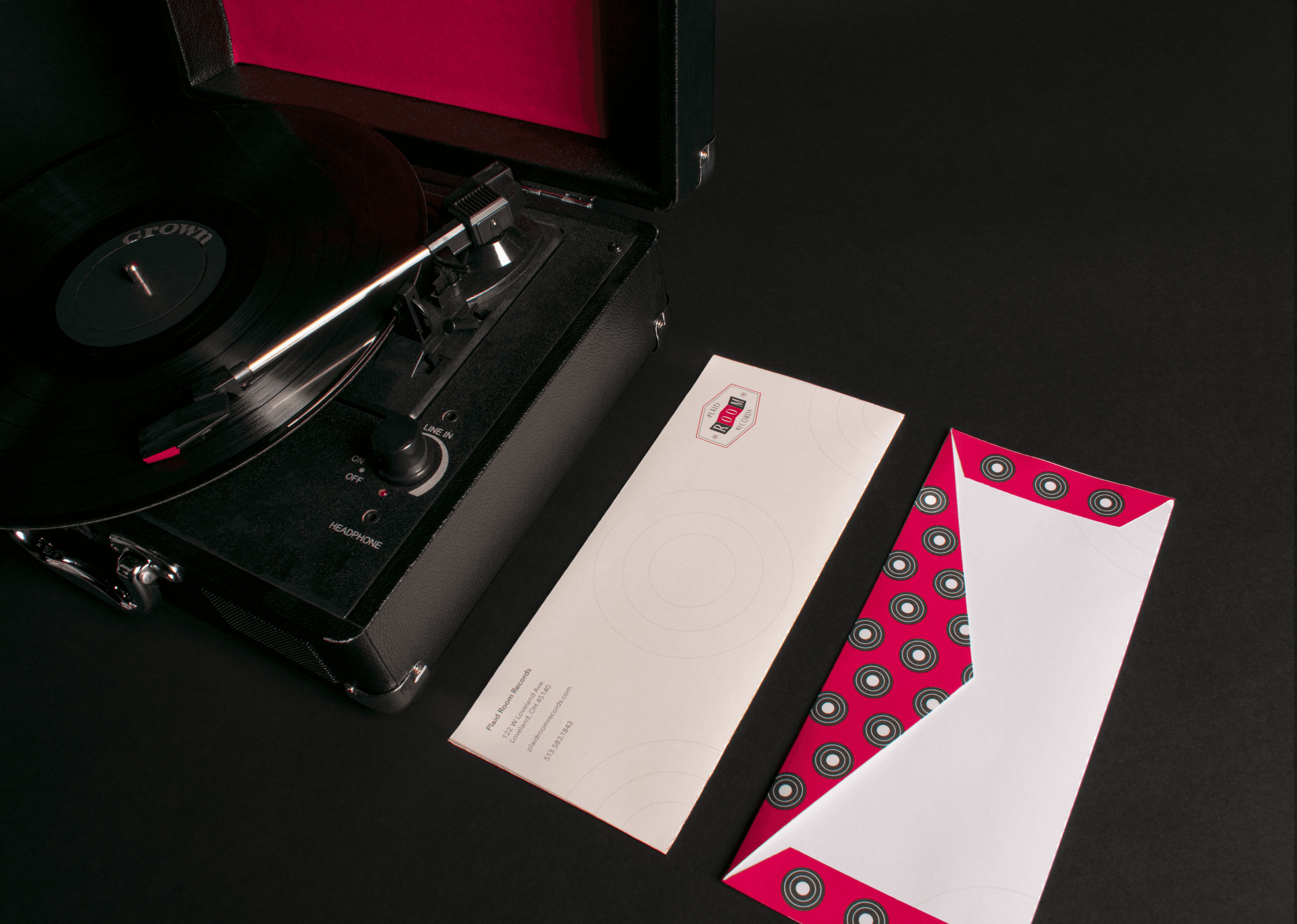
This branding project was created for Plaid Room Records, a small local shop specializing in both old and new albums.
One of the reasons vinyl records have resurged in popularity is that many people yearn for an earlier era when life moved at a slower, more deliberate pace. With a record player, listeners are forced to sit down and enjoy the music. Since records are a staple of the past, this logo rebrand was created around a retro aesthetic that gives music lovers that nostalgic feeling found in the grooves of vinyl.

LOGO IDEATION
I chose red as the primary color because red is strongly associated with high energy and is one of the most common hues found in traditional plaid patterns, making the design feel both bold and familiar.

VISUAL DIRECTION
I picked a 1950’s cartoon aesthetic to capture the beginning of the vinyl record golden age. I wanted to honor the time it became the dominant format—a decade that helped shape how we think about music culture and audio quality today.
I used circles as a key element to reference the grooves of vinyl records and to balance the design against the logo’s more angular look. The contrast between the soft curves and the sharp angles helps create visual harmony while reinforcing the thematic connection to vinyl.
PLAID ROOM RECORDS
BRAND IDENTITY
LOGO DESIGN
PRINT DESIGN
One of the reasons vinyl records have resurged in popularity is that many people yearn for an earlier era when life moved at a slower, more deliberate pace. With a record player, listeners are forced to sit down and enjoy the music. Since records are a staple of the past, this logo rebrand was created around a retro aesthetic that gives music lovers that nostalgic feeling found in the grooves of vinyl.
Plaid Room Records is a local shop that sells both old and new albums. Many of the deliverables feature patterns and icons to showcase the playful 1950’s vibes while maintaining a modern appeal.

LOGO IDEATION
I chose red as the primary color because red is strongly associated with high energy and is one of the most common hues found in traditional plaid patterns, making the design feel bold yet familiar.
VISUAL DIRECTION
I picked a 1950’s aesthetic to capture the beginning of the vinyl golden age. I wanted to honor the time it became the dominant format—a decade that helped shape how we think about music culture and audio quality today.
I used circles as a key element to reference the grooves of vinyl records and to balance the design against the logo’s more angular look. The contrast between the soft curves and the sharp angles helps create visual harmony while reinforcing the thematic connection to vinyl.
PLAID ROOM RECORDS
Many people yearn for an earlier era when life moved at a slower, more deliberate pace. With a record player, listeners are forced to sit down and enjoy the music. Since records are a staple of the past, this logo rebrand was created around a retro aesthetic that gives music lovers that nostalgic feeling found in the grooves of vinyl.
LOGO IDEATION
I chose red as the primary color because red is strongly associated with high energy and is one of the most common hues found in traditional plaid patterns, making the design feel bold yet familiar.

VISUAL DIRECTION
I picked a 1950’s aesthetic to capture the beginning of the vinyl golden age. I wanted to honor the time it became the dominant format—a decade that helped shape how we think about music culture and audio quality today.
I used circles as a key element to reference the grooves of vinyl records and to balance the design against the logo’s more angular look. The contrast between the soft curves and the sharp angles helps create visual harmony while reinforcing the thematic connection to vinyl.